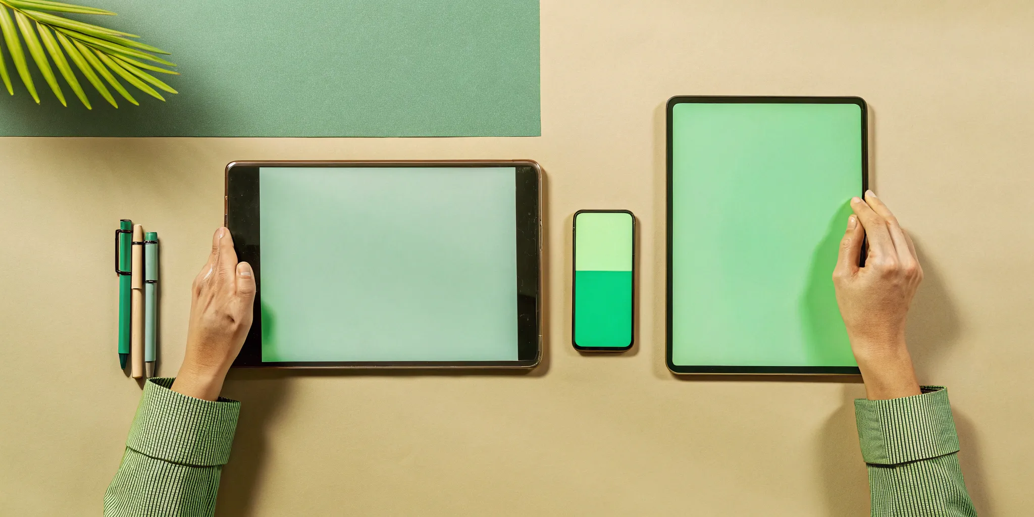
10 Principles of Handheld Device Design
The moment someone picks up a device, your client’s brand is having a conversation with them. If that device is awkward to hold, confusing to operate, or feels cheap, the conversation starts on the wrong foot. A positive user experience is non-negotiable, and it begins with putting the user first. Creating a product that feels like a natural extension of the hand is the central mission of thoughtful handheld device design. It’s a process rooted in empathy, focused on how a person will actually interact with the object in their daily life. We’ll cover the key elements that contribute to a great experience, from intuitive button placement and clear interfaces to inclusive features that welcome every user.
Key Takeaways
- Design for the hand, not just the eye: A successful handheld product feels intuitive and comfortable to hold, which means prioritizing ergonomics, logical button placement, and a balanced weight to create a seamless user experience.
- Integrate engineering from day one: A great concept becomes a viable product when design and engineering work together from the start to solve critical challenges like battery life, heat management, and fitting components into a compact space.
- Choose materials that tell a story and last: The materials you select define the product's look, feel, and durability, so test your choices to ensure they can withstand real-world use and reflect the quality of your client's brand.
What are the core principles of handheld design?
Creating a great handheld device is about more than just shrinking technology. It’s about designing an object that feels like a natural extension of the user's hand. Whether we're developing a high-tech tool for a startup or a unique piece of merchandise for a global campaign, the same foundational principles apply. These core ideas ensure the final product isn't just functional, but also desirable and intuitive. Getting them right is the difference between a product that people tolerate and one they love to use. For any agency looking to bring a physical product to life, understanding these principles is key to a successful project.
Balance form and function
A product that looks incredible but doesn’t work is just a paperweight. On the other hand, a device that works perfectly but looks clunky will never connect with users. The magic happens when aesthetics and functionality are in perfect harmony. A successful product needs to strike the right balance between a visually appealing design and a user-friendly experience. This is especially true for branded products, where the look and feel directly reflect your client’s identity. Our job is to ensure the device performs its function flawlessly while feeling great in the hand.
Put the user first
Before we can design a great product, we have to understand the person who will be using it. A user-centered approach is non-negotiable. This means we start with in-depth user research to learn about the target audience’s needs, habits, and expectations. Who are they? Where will they use this device? The answers inform every design choice, from the shape of the casing to the placement of the buttons. By putting the user first, we create intuitive products that feel like they were designed just for them, ensuring a positive brand experience.
Choose materials built to last
The materials used in a handheld device define its character, affecting its weight, feel, and ability to survive daily life. A device needs to be built with strong, durable materials that can handle being dropped, tossed in a bag, or used on the go. Reliability is just as important, especially for products that serve a critical function. We also consider serviceability, making sure the device can be repaired if something goes wrong. This choice impacts the product's longevity and the user's perception of its quality, protecting your client's brand reputation.
How does ergonomics make a device comfortable?
A handheld device can have the most brilliant technology packed inside, but if it’s awkward or painful to hold, it’s a failure. This is where ergonomics comes in. It’s the science of designing products to fit the people who use them, not the other way around. For handheld devices, great ergonomics means the product feels like a natural extension of your hand. It’s comfortable to hold for long periods, easy to grip securely, and intuitive to operate without causing strain.
Getting ergonomics right is a non-negotiable part of our design process. It’s a careful blend of art and engineering that considers the physical realities of the human body. We focus on three core areas to ensure a device is truly comfortable: designing for the hand’s natural shape, perfecting the weight and balance, and optimizing the entire experience for one-handed use. These elements work together to create a product that people not only can use, but actually enjoy using.
Design for the human hand
The human hand is an incredibly complex tool, and designing something to fit it perfectly is a serious challenge. As product design firm Delve notes, designers often struggle because there isn't enough good data about how far people's thumbs can reach and how they grip devices. Our approach starts with a deep respect for the user’s physical experience. We study how people naturally hold objects to inform every curve, contour, and surface of a device.
This means getting rid of sharp edges that dig into the palm and creating soft, rounded forms that invite a secure grip. We use human-centered design principles to map out where fingers and thumbs rest, ensuring that key buttons and touchpoints are always within easy reach. The goal is to minimize strain and make interaction feel effortless.
Get the weight and balance right
The weight of a device is more than just a number on a spec sheet; it’s about how that weight feels in your hand. A product that is poorly balanced can feel heavier than it actually is, causing wrist fatigue and feeling unstable. As one industry guide points out, "Devices should feel good in the hand, be easy to grip, and not cause strain." This is achieved by carefully managing the product’s center of gravity.
Our engineers strategically place heavier internal components, like batteries and motors, to create a stable, centered balance point. When a device is properly balanced, it rests comfortably in the user’s palm and feels secure, not like it’s about to tip over. This attention to detail makes the product feel more premium and thoughtfully crafted.
Optimize for one-handed use
Think about all the times you use a device with only one hand free, whether you’re carrying bags, holding a coffee, or commuting. A design that ignores this reality is a design that ignores the user. Optimizing for one-handed use is a critical principle that influences a device’s size, shape, and interface. The product needs to be light and compact enough to be held and operated securely without needing a second hand for support.
This is where we focus on the "thumb zone," the area of the screen that can be comfortably reached with the thumb. We ensure that the most common and critical functions are placed within this zone, preventing the user from having to perform awkward hand gymnastics. It’s a seamless integration of physical design and user interface that makes the device truly practical for real-world scenarios.
What features make a device easy to use?
A beautiful device that’s a pain to use is a failure. When you’re creating a product for a brand campaign or a high-end influencer kit, the user experience is everything. A clunky interface or a confusing button layout can create frustration, which is the last thing you want associated with your client’s brand. True usability comes from thoughtful design that anticipates the user’s needs and makes every interaction feel effortless. It’s about creating a seamless connection between the person and the product, where the technology gets out of the way.
This means focusing on clarity, simplicity, and intuitive controls. When a device just works the way you expect it to, it builds trust and leaves a lasting positive impression. That’s the goal for any physical product you put out into the world. It’s not just about aesthetics; it’s about function that feels invisible. For agencies, delivering a product that is genuinely easy to use reinforces the brand’s message of quality and thoughtfulness. It shows an attention to detail that goes beyond the surface, creating a memorable experience that connects with people on a practical level. Getting these details right is what separates a forgettable gadget from a beloved product.
Place buttons intuitively
Think about the last time you picked up a new remote control. You probably knew where to find the volume and power buttons without even looking. That’s intuitive design. Buttons, switches, and other physical controls should be placed where users naturally expect them. This often means following established conventions, like putting volume controls on the side of a device. The placement of these controls is crucial for ensuring that people can operate the device without confusion. Beyond location, the feel of a button matters, too. A satisfying click provides feedback that the action was registered. Clear, simple icons also help remove any guesswork, making the device feel instantly familiar and easy to handle.
Ensure the screen is clear and readable
If users have to squint to see the screen, the design isn't working. A clear and readable display is fundamental to a good user experience, especially on a small handheld device. This goes beyond just screen resolution. You need to consider font size, color contrast, and brightness levels that adapt to different environments, from a dark room to bright sunlight. Glare is another major factor that can render a screen useless outdoors. The best way to get this right is through real-world user testing, which gives you direct feedback on how the display performs. A screen should communicate information effortlessly, not make the user work for it.
Create an interface for small screens
Designing an interface for a small screen is an exercise in minimalism. You have limited real estate, so every element must have a clear purpose. A cluttered screen is a confusing screen. The key is to prioritize the most important information and actions, creating a clean layout that guides the user. This also means designing touch targets, like buttons and icons, that are large enough to be tapped accurately with a fingertip. Nothing is more frustrating than constantly hitting the wrong button. A well-designed mobile user interface feels spacious even on a tiny display, making interactions smooth and error-free.
How can you make your design inclusive?
Great product design solves problems for people, and that means thinking about all people. Inclusive design isn't a niche or an add-on; it's a core principle that makes a product better for everyone. When you create a handheld device, you’re building a physical touchpoint for a brand. The goal is to make that interaction feel effortless and welcoming, regardless of who is holding it. By considering users with different abilities, ages, and contexts from the very beginning, you create a more intuitive and successful product.
This approach also has a huge impact on a brand's reach. A device that’s easy for someone with limited mobility to use is often easier for someone carrying groceries to use, too. Features designed for users with low vision, like high-contrast screens, also work better in bright sunlight for any user. Thinking inclusively expands your audience and shows that a brand cares about its entire community. It’s about designing with empathy to create products that feel like they were made for you, no matter who you are.
Include features for all abilities
Building for inclusivity means moving beyond the "average" user and considering a wide spectrum of abilities. For a handheld device, this could mean incorporating strong haptic feedback so a user can feel a confirmation without having to see it. It might involve adding clear, tactile buttons that are easy to distinguish by touch, or ensuring the device is compatible with common assistive technologies. The goal is to provide multiple ways for people to interact with the product. By making a design accessible, you create a more robust and user-friendly experience for every single person who picks it up.
Consider every age group
A product that works for a 20-year-old might be frustrating for their 70-year-old grandparent. Designers often unintentionally overlook the needs of older adults, but this demographic represents a huge and growing market. When we design, we think about factors like declining grip strength, changes in vision, and different levels of tech familiarity. This leads to practical decisions, like creating a lightweight and balanced form, offering adjustable text sizes and high-contrast display modes, and keeping the interface straightforward. A product that feels comfortable and intuitive across generations has a much greater chance of becoming a household staple.
Aim for universal appeal
Ultimately, inclusive design is smart business. When a product is accessible to more people, it’s marketable to more people. Devices that fail to consider the needs of users with disabilities or older adults don't just exclude a large demographic; they miss a major market opportunity. Building inclusivity into the design process from day one helps create a product with the broadest possible appeal. This isn't just about compliance or avoiding alienation. It's about building a stronger, more resonant brand that feels welcoming to everyone and delivers a consistently excellent user experience.
What engineering challenges impact handheld design?
A beautiful handheld device feels effortless to use, but beneath its polished surface lies a complex network of engineering solutions. Getting a product to look great is one thing; making it work flawlessly is another challenge entirely. This is where the worlds of industrial design and product engineering must align perfectly. Every design choice, from the curve of the casing to the placement of a button, has a ripple effect on the internal components, influencing everything from performance to durability.
Successfully launching a handheld product means solving a few key engineering puzzles from the very beginning. The three biggest hurdles are managing power consumption, dealing with heat, and fitting an ever-growing list of components into a shrinking space. These challenges aren’t just abstract technical details for an engineer to worry about; they directly shape the user experience. A device that overheats, dies after a few hours, or feels bulky will fail in the market, no matter how good it looks. A great design is one where these technical constraints have been solved so elegantly that the user never even knows they existed. This is the invisible work that turns a creative concept into a reliable, real-world product.
Plan for battery life and power
A device that’s constantly tethered to a charger isn’t very "handheld." That’s why battery life is one of the most critical factors in product design. You can’t just stick the biggest battery possible inside and call it a day; that would make the device heavy, bulky, and expensive. The real goal is power efficiency.
Engineers achieve this by carefully selecting components that sip power instead of guzzling it. They also design smart power management systems that optimize usage, like putting the device into a low-power "sleep mode" when it’s not active. It’s a delicate balance of hardware and software working together to make sure the device is ready when the user needs it, from the first morning meeting to the last evening email.
Manage heat effectively
Every electronic component generates heat, and in a compact handheld device, that heat can get trapped. If not managed properly, excess heat can slow down performance, damage the internal circuitry, and even make the device uncomfortably hot to hold. This is a major engineering challenge that requires a proactive strategy, not an afterthought.
Effective thermal management involves a combination of clever solutions. This can include using materials that naturally dissipate heat, designing subtle ventilation paths, or incorporating miniature heat sinks to draw warmth away from critical processors. The goal is to keep the device running at an optimal temperature without resorting to noisy fans or bulky components, ensuring the product is both safe and pleasant to use.
Solve for smaller components
Users want devices that are smaller, thinner, and lighter, but they also want more features. This creates a classic engineering puzzle: how to fit all the necessary technology into an increasingly tiny space. Every internal part, from the circuit board and battery to the screen, sensors, and antennas, is fighting for precious real estate.
This is where precise mechanical engineering becomes the hero. Using advanced CAD software, engineers can map out the placement of every component down to the sub-millimeter level, ensuring everything fits together perfectly without interference. It’s a game of Tetris played with high-tech parts, where a single millimeter can make the difference between a sleek, integrated design and a product that’s impossible to manufacture.
How do materials impact performance?
The materials you choose for a handheld device do more than just define its look; they dictate how it feels, how it performs, and how long it lasts. This decision is a critical balancing act between aesthetics, function, and budget. The right material can make a product feel premium and substantial, while the wrong one can make it feel cheap or fail under pressure. For agencies creating physical assets for a campaign, material selection is a core part of the brand story. It communicates quality and intent before the user even turns the device on. Thinking through these choices early in the design process ensures the final product not only looks the part but can also withstand real-world use.
Choose between plastic and metal
The choice between plastic and metal is one of the first and most important decisions in handheld device design. Each material offers a distinct set of trade-offs that can shape the user's entire experience. Metal alloys, like aluminum or stainless steel, provide a premium feel and durability, giving a device a satisfying weight and structural rigidity. However, metal can be more expensive to machine and may interfere with wireless signals.
On the other hand, plastic is incredibly versatile. It’s lightweight, cost-effective for high-volume production, and can be molded into complex, ergonomic shapes that would be difficult or impossible to achieve with metal. It also allows for a wider range of colors and finishes, and it’s transparent to radio frequencies, which is essential for connected devices. The decision ultimately comes down to your project's goals: are you aiming for a rugged, high-end feel or a lightweight, accessible, and cost-effective design?
Add texture for a better grip
Texture is a powerful tool that goes far beyond aesthetics; it’s a key component of a device's usability. A smooth, glossy surface might look sleek in a product photo, but in someone's hand, it can be slippery and prone to smudges. Incorporating a thoughtful texture can dramatically enhance grip and prevent slippage, making the device feel more secure and comfortable to hold.
Consider options like a soft-touch coating for a velvety feel, a subtle stippled pattern for better traction, or rubberized overmolding on key contact points. Texture can also guide the user's hand to buttons or interaction zones without them needing to look. For a branded product, the tactile experience is a subtle but memorable part of the interaction, reinforcing brand attributes like ruggedness, precision, or comfort.
Test for durability and drops
Handheld devices lead a tough life. They get tossed in bags, knocked off tables, and dropped on hard surfaces. Your material choices are your first line of defense against this everyday abuse. While aesthetics are important, a material must also be selected for its ability to withstand impacts, scratches, and general wear and tear. This is where engineering and design work hand-in-hand.
Durability testing is crucial for ensuring a product can survive in the real world. This involves more than just theoretical calculations; it means conducting physical drop tests, abrasion tests, and environmental stress tests on prototypes. Choosing a durable polymer or a resilient metal alloy can be the difference between a product that lasts and one that disappoints. For any agency, delivering a physical product that breaks easily can damage a client's brand reputation, so building for durability is non-negotiable.
Why is user feedback so important?
Designing a handheld device in isolation is a recipe for failure. You can have the most brilliant concept and the sleekest aesthetics, but if the product doesn't feel right in a user's hand or solve a real problem, it won't connect. This is where user feedback becomes your most valuable asset. It’s the bridge between your creative vision and a product that people genuinely love and use. For agencies creating physical products for campaigns, this step is non-negotiable. A positive user experience creates a positive brand association, while a frustrating one can do the opposite.
Gathering feedback isn't a one-time event; it's a continuous conversation that should start early and carry through the entire development process. By putting prototypes in front of real people, you move beyond assumptions and start designing based on evidence. You learn what works, what doesn’t, and why. This iterative process of testing and refining is what separates good products from great ones. It ensures the final design is not only beautiful and functional but also intuitive and meaningful to the people it’s made for.
Prototype and test your designs
A prototype is more than just a showpiece for a client presentation; it’s a learning tool. Getting a physical model into the hands of your target audience is the fastest way to get honest, actionable feedback. User testing reveals critical insights about the real-world experience, from how comfortable the device is to hold to whether the button placement makes sense. These sessions allow you to observe how people actually interact with your design, often uncovering usability issues you never would have anticipated.
Incorporating this feedback allows you to refine your prototypes with confidence. Each iteration gets you closer to a final product that truly meets the needs and expectations of its users. This process of iterative design is essential for validating your ideas before committing to expensive tooling and manufacturing. It’s about making informed decisions that ensure the final product is not just functional, but genuinely user-friendly.
Learn from real-world use
Understanding how a device performs in a lab is one thing, but seeing how it fits into someone’s daily life is another. Real-world feedback gives you a deeper context that is invaluable for making smart design choices. Through direct user research, you can learn how people discover the need for a product like yours, what features they gravitate toward, and how the device integrates into their routines. This is where you uncover the nuances of user behavior.
This kind of qualitative insight helps you build a product that feels like it was designed just for them. For agencies, this information is gold because it informs not only the product’s features but also the story you tell around it. When you understand the user’s world, you can create a product and a campaign that resonates on a much more personal level, making the brand experience more authentic and memorable.
Balance how it looks with how it works
Creative agencies excel at creating stunning visuals, but for a physical product, aesthetics are only half the equation. A device can be beautiful, but if it’s confusing or uncomfortable to use, the design has failed. The ultimate goal is always to create a positive and meaningful experience for the user. A successful handheld product is one that strikes the perfect balance between aesthetics and functionality.
User feedback is your guide to finding that balance. It helps you understand which aesthetic choices might be compromising usability and where function could be improved without sacrificing form. Listening to users ensures you don’t prioritize one at the expense of the other. The most beloved products are those that look incredible and feel effortless to use. This synergy of beauty and logic is what turns a simple object into a valued part of someone’s life.
How can you optimize screens and interfaces?
The physical design of a handheld device is just one part of the user experience. The screen is where your audience will interact with the product, so the interface needs to be just as thoughtfully engineered as the hardware. For agencies creating branded products, the user interface (UI) is a powerful touchpoint, a direct line to the customer that can either strengthen or weaken the brand connection. A great interface feels intuitive and seamless, guiding the user without getting in the way. It’s the digital handshake that welcomes them into the experience you’ve built.
Ensure the screen is responsive
Handheld devices aren’t one-size-fits-all, and neither are their screens. A responsive design ensures your interface looks and works perfectly on any screen size, from a compact wearable to a larger tablet. This means that buttons, text, and images automatically resize and reflow to fit the available space, providing a consistent and user-friendly experience no matter what. A non-responsive screen can make a product feel broken or unprofessional, immediately frustrating the user. Getting this right is fundamental to successful mobile UX design and is non-negotiable for any modern device.
Create a clear visual hierarchy
A well-designed screen guides the user’s eye to the most important information first. This is achieved through a clear visual hierarchy, where you use size, color, contrast, and placement to signal what matters most. The primary action you want someone to take should be the most prominent element on the screen. This principle is all about balancing aesthetics and functionality. While the interface should align with your brand’s visual identity, its main job is to make the device easy to use. By establishing a clear hierarchy, you reduce cognitive load and help users accomplish their goals quickly and without confusion.
Integrate AI and AR
To create truly memorable brand moments, you can go beyond static screens by integrating artificial intelligence (AI) and augmented reality (AR). AI can personalize the user experience by learning individual preferences and adapting the interface accordingly. Imagine a device that surfaces a user’s favorite features automatically. AR takes this a step further by blending the digital and physical worlds. A device’s camera can be used to overlay interactive graphics, animations, or information onto a user’s environment, creating deeply immersive experiences. For agencies, this opens up incredible creative possibilities for campaigns that are interactive and unforgettable.
How does manufacturing influence design?
A brilliant concept for a handheld device is one thing, but turning it into a physical product that you can produce by the thousands is another challenge entirely. This is where manufacturing considerations come into play, not as a final hurdle, but as a guiding principle from the very first sketch. Thinking about the production line from day one is the secret to creating a product that is not only beautiful and functional but also profitable and reliable. For creative agencies, this means your ambitious ideas for a branded device or an immersive campaign asset can actually be built, on time and on budget.
This approach, often called Design for Manufacturability (DFM), is all about making smart choices early on to prevent costly changes later. It involves asking questions like: How will this part be made? Can we simplify this assembly? Is there a more efficient material we could use? By integrating engineering logic with creative vision, we can design products that are built for success at scale. It’s a process that ensures the final product that lands in a customer's hands is just as impressive as the initial concept your team fell in love with, without any last-minute production surprises.
Design for scalable production
Designing a single, perfect prototype is different from designing a product that can be manufactured 10,000 times with consistent quality. When you’re planning for mass production, every detail matters. The specific curve of a corner, the way two pieces snap together, or the type of finish on a surface can dramatically impact production speed and cost. We focus on creating designs where each component can be efficiently replicated. This means planning for things like mold creation, assembly line workflow, and automated processes. By anticipating the realities of the factory floor during the design phase, we ensure a smooth transition from a beautiful 3D model to a high-quality, scalable product that meets demand without compromising on your creative intent.
Source materials cost-effectively
The materials you choose define how a device looks, feels, and performs. They also play a huge role in the final unit cost. While premium materials like machined aluminum or Gorilla Glass can create a high-end feel, they aren't always necessary or budget-friendly. Part of our job is to explore a wide range of options to find the sweet spot between aesthetics, durability, and affordability. We might recommend an advanced polymer with a metallic finish that delivers a premium feel without the high cost of actual metal. A thoughtful material selection process ensures your product feels substantial and high-quality while keeping production costs manageable and protecting your profit margins.
Plan for quality control
Nothing undermines a great product launch faster than quality issues. That’s why planning for quality control starts long before the first unit comes off the assembly line. It’s built directly into the design itself. This means designing parts with tolerances that ensure a perfect fit every time and creating clear assembly instructions that leave no room for error. We also establish testing protocols to catch potential problems early, from drop tests that simulate real-world accidents to electronic diagnostics that verify performance. By embedding quality assurance into the design and engineering process, we can minimize defects, ensure product reliability, and protect the brand experience you’ve worked so hard to create.
What's next for handheld devices?
The world of handheld devices is constantly evolving, and staying ahead of the curve is key to creating products that feel truly innovative. While the core principles of good design remain the same, new technologies are pushing the boundaries of what’s possible. For brands and creative agencies, these shifts aren't just trends; they're opportunities to create unforgettable physical experiences. Imagine a promotional product that literally unfolds to reveal a bigger message, or a piece of branded tech that uses biometrics for exclusive access.
Understanding where the industry is headed helps you design products that are not only relevant today but also prepared for tomorrow. It’s about balancing cutting-edge features with the practical engineering needed to make them work flawlessly. As we look to the future, three major shifts are shaping the next generation of handhelds: screens that bend, security that’s personal, and a much-needed focus on sustainability. These aren't just abstract concepts; they are tangible design challenges and exciting creative prompts for anyone looking to build the next great device.
Foldable and flexible screens
The idea of a large screen that can fold up and fit in your pocket is no longer science fiction. Foldable and flexible screens are changing how we think about device footprints, allowing for expansive displays in surprisingly compact forms. This technology opens up a whole new world for user interaction. Think about a device that can be a standard phone one moment and a small tablet the next, creating new possibilities for multitasking and immersive experiences. For product designers, this presents a fascinating engineering puzzle: how do you create a hinge that’s both durable and seamless? How does the user interface adapt as the screen changes shape? It’s a game-changer for portability and function.
The rise of biometrics
Security is more important than ever, and biometrics are becoming the standard for keeping devices safe and personal. Features like fingerprint scanners and facial recognition are moving from high-end novelties to everyday expectations. This shift is driven by a demand for security that is both stronger and more convenient than a simple password. For users, it creates a seamless way to access their devices and data. For designers and brands, integrating biometrics offers a chance to build more personalized experiences, where the device instantly recognizes and adapts to its owner. It’s a powerful tool for creating a product that feels truly connected to the user.
A focus on sustainable design
As consumers become more aware of their environmental impact, the demand for sustainable products is growing louder. The tech industry is responding with a greater focus on sustainable design, from the materials used to the energy consumed. This means prioritizing recycled plastics, responsibly sourced metals, and components that are more energy-efficient. For brands, this is a massive opportunity to align a physical product with company values. Creating a device with eco-friendly materials isn't just good for the planet; it’s a powerful story that resonates with modern consumers and shows a genuine commitment to responsible innovation. It’s about designing products that people can feel good about owning.
Related Articles
- Human Factors in Product Design: A Practical Guide — Jackson Hedden
- Wearable Product Design: A Complete Guide
- Medical Device Industrial Design: A Complete Guide
- Consumer Product Design: The Ultimate 2025 Guide — Jackson Hedden
- Guide to Consumer Product Design — Jackson Hedden
Frequently Asked Questions
What's the most common mistake to avoid when designing a physical product for a campaign? The biggest pitfall is falling in love with a beautiful render without thinking about how it will actually feel and function in someone's hand. A concept can look perfect on screen, but the real test is its physical form. Skipping straight to manufacturing without considering ergonomics, user feedback, or material durability often leads to a product that's awkward to hold, confusing to use, or breaks easily. This creates a negative brand experience, which is the exact opposite of your goal.
How do you ensure a creative vision isn't lost during the technical engineering process? This is a common concern, but it helps to see engineering not as a roadblock, but as a creative partner. The key is collaboration from the very beginning. When our design and engineering teams work together from the initial sketch, we can solve technical challenges in ways that support the creative vision. Sometimes, a manufacturing constraint can even lead to a more interesting and unique design solution. It’s a constant conversation that balances what’s possible with what’s ideal to make sure the final product is both manufacturable and true to the original idea.
Why is user testing important for a simple promotional product? Even the simplest device creates a physical brand experience. You want that experience to be positive, memorable, and seamless. User testing helps you find out if the product feels cheap, if the texture is unpleasant, or if a button is in an awkward spot. These small details make a huge difference in how someone perceives the brand. For a promotional item, the goal is to create a positive connection, and testing is the best way to ensure your product feels thoughtful and high-quality, not like a frustrating afterthought.
How early in the process should we start thinking about manufacturing? You should start thinking about manufacturing on day one. It might sound early, but the choices you make in the initial design phase have the biggest impact on the final cost and timeline. Decisions about materials, complexity, and assembly directly influence how scalable and affordable the product will be. By considering manufacturing from the start, you can avoid major redesigns later in the process, ensuring a smoother path from concept to production without any costly surprises.
Can a product be both innovative and durable? Absolutely, but it requires intentional engineering. Creating something new, like a device with a flexible screen, also means solving new durability challenges, like designing a hinge that can withstand thousands of folds. True innovation isn't just about the flashy new feature; it's about making that feature reliable for everyday use. This is achieved through rigorous testing, smart material selection, and a deep understanding of how to protect sensitive components from real-world stress like drops and bumps.