What Is a Design Language System? A Simple Guide
Your agency just landed a huge project. The campaign is brilliant, the client is thrilled, and the vision involves a whole family of physical products. Now comes the hard part: how do you ensure the hero product, the influencer kit, and the retail packaging all feel like they belong together? This is where a design language system comes in. It’s the strategic framework that ensures consistency at scale. Instead of designing each item in a vacuum, you build from a central library of rules, components, and principles. This system is what allows your big idea to grow into a cohesive product ecosystem without diluting the brand’s identity or quality.
Key Takeaways
- Go beyond a style guide: A Design Language System is the single source of truth for your product, defining not just visuals like color and typography, but also physical materials, textures, and interaction patterns. It acts as a shared blueprint that aligns creative vision with engineering reality.
- Build faster and more consistently: With a library of reusable components and clear standards, you eliminate redundant decisions and guesswork. This allows your team and engineering partners to work more efficiently, ensuring every product—from a hero device to its packaging—is cohesive and gets to market on schedule.
- Plan for adoption and evolution: A design system is a living tool, not a one-time project. Its success depends on team buy-in and ongoing maintenance. Prioritize clear documentation, a collaborative update process, and education to ensure the system remains a valuable, actively used asset.
What is a Design Language System?
Think of a Design Language System (DLS) as the ultimate brand style guide, but built specifically for a product. It’s a centralized rulebook that defines everything from the exact shade of your brand’s blue to the satisfying click a button should make. While the term is popular in the world of digital apps and websites, the principle is just as critical for physical products. For agencies tasked with creating unforgettable brand experiences, a DLS is what ensures a line of smart devices, a piece of high-end merchandise, or an influencer kit feels cohesive, intentional, and premium.
A DLS is more than just a collection of visual assets; it’s a living, breathing toolkit of reusable components, standards, and guidelines. It’s the single source of truth that aligns your creative vision with our engineering execution. Instead of reinventing the wheel for every new product or campaign asset, your team and ours can pull from an established library of design patterns and physical components. This ensures that whether you’re launching one hero product or an entire ecosystem of them, the look, feel, and function remain perfectly consistent and true to the brand.
Why it matters for product development
In the fast-paced world of agency projects, efficiency is everything. A Design Language System is your secret weapon for moving faster without sacrificing quality. It streamlines the entire development process by giving designers, engineers, and stakeholders a shared vocabulary and a clear set of rules to follow. This alignment minimizes guesswork, reduces endless feedback loops, and helps everyone make better decisions, faster. The result is a cohesive product family that gets to market on schedule and a process that allows your team to power design at scale, hitting even the tightest campaign deadlines.
Creating a single source of truth for design
At its core, a DLS creates a single, reliable source of information for the entire team. It’s the one place everyone—from your creative director to our mechanical engineers—goes to find the definitive answer on how a product should look, feel, and behave. This isn't just about colors and logos. A robust DLS for a physical product includes everything from approved materials and finishes to ergonomic standards and interaction patterns. This comprehensive set of guidelines ensures that every element, whether it’s a tiny LED indicator or the main housing, is designed and manufactured with consistency and precision.
What Goes Into a Design Language System?
A design language system is the blueprint for your product’s entire look, feel, and function. Think of it as a comprehensive toolkit that goes far beyond a simple brand style guide. It’s a living, breathing collection of standards that ensures every part of your product—whether it’s a button in an app or a physical knob on a device—feels like it belongs to the same family. By defining everything from visual aesthetics to user interactions, a DLS creates a single, reliable source of information that keeps your entire team aligned and your brand experience cohesive.
Visuals and brand identity
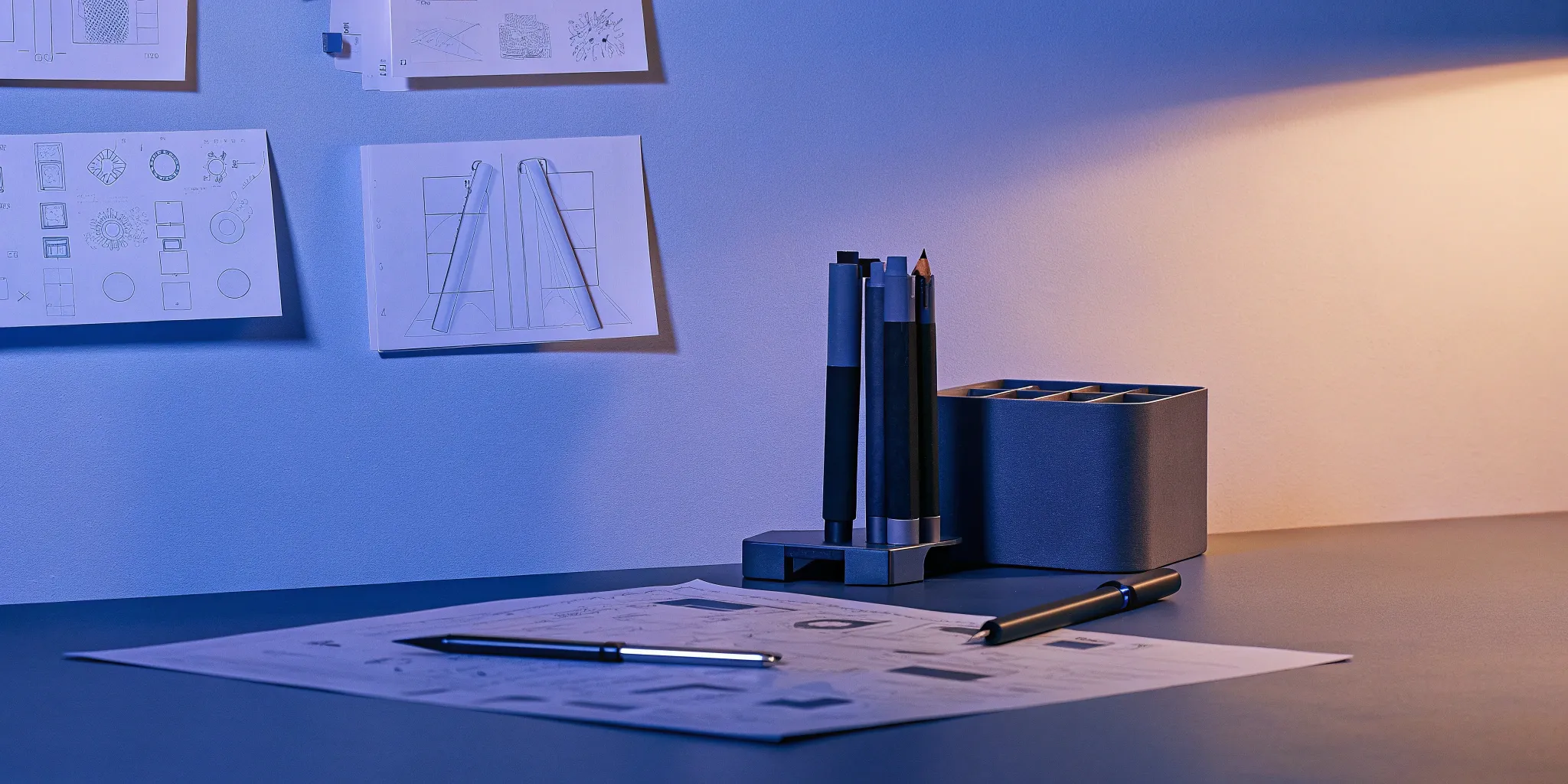
This is the foundation of your design language. It’s where you define the core aesthetic elements that make your product instantly recognizable. For physical products, this goes deeper than just logos and color palettes. It includes the specific materials, finishes, and textures that create the tactile experience. Are the forms soft and rounded or sharp and geometric? How is the logo applied—is it molded, printed, or laser-etched? These decisions codify your brand’s personality into tangible qualities, ensuring every product consistently communicates your intended message and feels like a cohesive part of your brand ecosystem.
Reusable UI components
In the digital world, these are things like buttons, menus, and form fields. For physical products, the concept is the same: a library of standardized, reusable parts. These can be anything from common fasteners and connectors to modular enclosures, buttons, or even specific unboxing elements. Creating a library of reusable components and patterns doesn't just save time and reduce design overhead; it streamlines manufacturing. By using pre-vetted, DFM-optimized parts across a product line, you ensure consistency, lower production costs, and get to market faster without reinventing the wheel for every new product.
Interaction patterns
Interaction patterns define the predictable ways a user engages with your product. In software, this might be how a user navigates a menu. In the physical world, it’s about the tactile experience. How does a lid snap shut? What is the audible and physical click of a button press? How does a product feel when you hold it? By standardizing these sensory and functional experiences, you create an intuitive and satisfying product. Consistent patterns mean users don’t have to relearn how to interact with the product each time, making the experience feel seamless and thoughtfully engineered.
Clear documentation and guidelines
Your design language system is only effective if people can understand and use it. That’s where clear documentation comes in. This is the rulebook that explains not just what each component is, but why it was chosen and how to use it correctly. For physical products, this includes detailed CAD standards, material specifications, and CMF (Color, Material, Finish) callouts. This documentation acts as a central place for all information, ensuring that everyone—from your internal team to external manufacturing partners—is on the same page. It’s what turns a great design into a consistently great product, no matter who is building it.
Why Your Team Needs a Design Language System
Building a physical product for a campaign or brand launch involves a ton of moving parts. You have your creative team, our industrial designers, and our engineers all working toward a single goal. Without a shared playbook, it’s easy for things to get lost in translation. A design language system (DLS) is that playbook. It’s the single source of truth that aligns everyone on the project, ensuring the final product is a perfect extension of the brand experience you’ve designed.
Think of it as the foundation for every design and engineering decision. It goes beyond a simple style guide by providing not just the what (colors, logos) but the why and how (principles, components, interaction patterns). For agencies, this is a game-changer. It means you can hand off a creative brief with confidence, knowing that the physical product—from its shape and texture to its on-screen interface—will be perfectly consistent with the brand’s identity. It streamlines the entire development process, making collaboration smoother and the final outcome more impactful.
Keep your brand consistent
Consistency is the bedrock of a strong brand. When a customer interacts with a product, every detail matters. A design language system acts as your brand’s North Star, providing a collection of rules and guidelines that ensure every element looks and feels cohesive. For a physical product, this means defining everything from the specific shade of a color and the texture of a material to the shape of a button and the typeface on the screen. This single source of truth eliminates guesswork, ensuring that whether we’re prototyping a device or designing its packaging, the result is always on-brand and instantly recognizable.
Work faster and more efficiently
Agency life moves fast, and deadlines are always tight. A DLS is built for speed. By creating a library of reusable components, styles, and patterns, we don’t have to reinvent the wheel for every new project or feature. Instead of starting from scratch, our designers and engineers can pull from an established toolkit of pre-approved elements. This approach dramatically cuts down on redundant work and decision-making. As a result, your team can focus on the bigger picture—like nailing the user experience and innovating on the core concept—while we handle the execution with speed and precision.
Create a better user experience
A product that’s confusing or unpredictable to use reflects poorly on the brand. Consistency is key to creating an intuitive user experience. When a product’s design elements and interaction patterns are predictable, users don’t have to think twice about how to use it. A DLS establishes these patterns, ensuring that the experience is seamless from the moment someone unboxes the product. Whether it’s the satisfying click of a button or the simple flow of a digital interface, a consistent and predictable design makes the product feel more thoughtful, reliable, and enjoyable to use.
Improve team collaboration
Great products are born from great collaboration. A design language system is the ultimate tool for bridging the gap between your creative team and our technical experts. It establishes a shared vocabulary and a clear set of rules that everyone on the project understands and follows. This common ground minimizes misinterpretations and streamlines the feedback process, making it easier for designers and engineers to work together effectively. When everyone is speaking the same language, we can move from creative vision to an engineered, production-ready product more smoothly, ensuring the final result is exactly what you imagined.
Design System vs. Style Guide: What's the Difference?
If you’ve been around product or brand discussions, you’ve probably heard the terms “design system” and “style guide” used interchangeably. It’s a common mix-up, but knowing the difference is key, especially when you’re trying to create a cohesive experience across both digital and physical products. Think of it this way: a style guide is a chapter in a much larger book, and that book is the design system.
While both tools aim to create consistency, a design system is a far more comprehensive and functional toolkit that directly impacts how efficiently your team can build things. It’s the difference between having a mood board and having a full set of blueprints. Let’s break down what sets them apart.
Understanding the scope
A style guide is essentially a rulebook for your brand’s visual identity. It focuses on the look and feel, documenting things like your logo usage, color palette, typography, and iconography. It answers the question, "What does our brand look like?" This document is crucial for keeping marketing materials, social media graphics, and packaging visually aligned. It ensures that no matter who creates something for your brand, it looks like it came from the same place.
A design system, on the other hand, is a living, breathing collection of reusable components and clear standards that guide the creation of products. It includes everything in the style guide but goes much further. It contains functional UI components (like buttons, forms, and navigation bars), code snippets, interaction patterns, and accessibility guidelines. It’s the single source of truth that tells your team not just how things should look, but how they should behave and be built.
A more strategic approach
A style guide is tactical; it helps you maintain brand consistency. A design system is strategic; it helps you build better, more cohesive products faster. Because it includes functional components and code, it creates a shared language that bridges the gap between creative vision and engineering execution. For an agency, this is a game-changer. It means your designers, our engineers, and any developers involved are all pulling from the same playbook.
This alignment is what allows teams to scale design effectively and avoid reinventing the wheel with every new project. Instead of designing a button from scratch every time, the team can grab the pre-built, pre-approved component from the system. This frees up everyone to focus on solving bigger strategic problems rather than getting bogged down in minor design decisions. The result is a more consistent user experience, a faster development cycle, and a stronger, more unified brand presence across every single touchpoint.
Common Challenges When Building a Design System
Creating a design system is a powerful move, but let’s be real—it’s not as simple as building a library and calling it a day. Like any valuable initiative, it comes with its own set of hurdles. The good news is that these challenges are completely manageable when you know what to expect. Most teams run into the same three issues: getting people to actually use the system, finding the resources to keep it alive, and making sure it truly connects the creative and technical sides of a project.
Thinking about these potential bumps in the road from the start will help you build a system that’s not just beautiful, but resilient and genuinely useful. The goal isn't just to document your design decisions; it's to create a living tool that your entire team—from designers and engineers to project managers—can rely on to do their best work. By anticipating these challenges, you can build a strategy that focuses on people and process, ensuring your design system becomes an asset instead of a chore.
Getting your team on board
A design system is only as good as its adoption rate. You can build the most elegant, comprehensive system in the world, but if your team doesn't use it, it’s just a folder of assets collecting digital dust. The biggest mistake is trying to enforce the system with a top-down mandate. Instead, the key is to focus on building buy-in by showing how it makes everyone’s job easier.
Involve your team in the creation process from the beginning. Ask them what their biggest pain points are. Is it recreating the same button for every new project? Is it guessing which hex code is the right brand blue? Show them how the system solves these specific problems. When people see the design system as a tool that saves them time and frustration, they’ll be eager to use it.
Finding time and resources for maintenance
Many teams treat a design system like a project: they build it, launch it, and move on. But a design system isn’t a project; it’s a product. And just like any product, it requires ongoing maintenance and support to stay relevant and useful. Components will need updating, new patterns will emerge, and brand guidelines will evolve. Without a dedicated team or at least a designated owner, the system will quickly become outdated.
It’s crucial to plan for this from day one. Allocate time and resources for regular updates and improvements. This might mean assigning a small, dedicated team or building maintenance into your regular workflow. Remember, a design system is never truly finished. Treating it as a living part of your product development process ensures it continues to deliver value long after its initial launch.
Bridging the gap between design and development
One of the greatest promises of a design system is creating a shared language between designers and developers—or in our world, between creative directors and engineers. This is where the magic happens, but it’s also a common point of friction. Creatives think in terms of vision and user experience, while engineers focus on manufacturability, materials, and technical constraints. A design system serves as the translator between these two worlds.
It ensures that a design concept is grounded in reality from the start. By defining components, materials, and assembly logic within the system, you can prevent last-minute surprises where a beautiful design turns out to be impossible or too expensive to produce. This alignment helps you scale design effectively, turning creative ideas into tangible, high-quality products faster and with fewer headaches.
How to Create a Design Language System
Building a design system might sound like a massive undertaking, but you can approach it methodically. It’s less about a giant, monolithic project and more about establishing a foundation and building on it over time. Think of it as creating a playbook for your brand’s visual and functional identity. Whether you're designing an app for a campaign, a website for a new brand, or a physical product for an experiential launch, these steps will help you create a system that ensures consistency and quality across every touchpoint.
The goal is to move from a collection of disconnected assets to a cohesive, strategic framework. This process turns abstract brand guidelines into a practical, living toolkit that your entire team—from designers and engineers to your agency partners—can use to build better, more aligned experiences. It’s about creating a single source of truth that saves time, reduces ambiguity, and allows everyone to focus on creative problem-solving instead of reinventing basic elements. By following a clear process, you can develop a system that not only looks great but also functions flawlessly, whether it’s on a screen or in someone’s hands. The key is to start with what you have, define where you want to go, and build the pieces that will get you there.
Start with a UI audit
Before you can build a unified system, you need to understand what you’re working with. A UI audit is essentially a design inventory. You’ll gather every component from your client’s digital and physical touchpoints—buttons, forms, icons, colors, typography, and even packaging materials. The goal is to spot inconsistencies and identify which elements are working well. This audit gives you a complete picture of the current state of the brand's design, highlighting redundancies and variations. It’s a critical first step that provides the raw material and the rationale for the system you’re about to build.
Define your visual language
Once you’ve inventoried your existing assets, it’s time to establish the rules. This is where you define the core principles of your design language. You’ll make firm decisions on typography, color palettes, spacing, iconography, and voice and tone. For physical products, this extends to CMF—Color, Material, and Finish. This stage is about creating a foundational style guide that articulates not just what to use, but why. Your visual language should be a direct reflection of the brand’s strategy and personality, ensuring every design choice feels intentional and aligned with the overall goals.
Build your components and patterns
This is where your system evolves from a set of rules into a functional toolkit. Instead of just describing what a button should look like, you build a reusable button component. You’ll create a library of elements—from simple atoms like icons and inputs to more complex organisms like navigation bars and product cards. For physical products, these "components" might be a standardized handle, a modular packaging insert, or a specific button mechanism. By creating a library of pre-built, pre-approved components, you ensure consistency and allow your team to assemble new experiences quickly and confidently, without reinventing the wheel every time.
Write clear documentation
A design system is only effective if people know how to use it. Clear documentation is the glue that holds everything together. This isn't just a style guide; it's a comprehensive resource that explains how and when to use each component and pattern. Good documentation covers the do's and don'ts, provides code snippets for developers, and explains the rationale behind design decisions. It should be a living, accessible resource for everyone involved in a project—designers, engineers, marketers, and agency partners. Think of it as the official user manual for your brand’s design, empowering everyone to build on-brand experiences correctly.
How to Get Your Team to Actually Use It
Building a design language system is one thing; getting your team to consistently use it is another challenge entirely. You can create the most beautiful, comprehensive system in the world, but if it just sits on a server collecting digital dust, it’s not doing its job. Adoption isn’t about forcing new rules on people—it’s about showing them a better, easier way to work.
The key is to treat the rollout of your design system like any other product launch. You need a strategy, a clear value proposition for your users (in this case, your team), and a plan for support. It’s a process of change management that requires empathy, clear communication, and a focus on making your team’s life easier. When people see that the system saves them time and helps them produce better, more consistent work, they’ll get on board. The goal is to make using the system feel like the path of least resistance.
Start small and build momentum
Trying to get everyone in your organization to adopt a new system all at once is a recipe for failure. Instead, start with a small, manageable pilot project. Choose a single team or a specific product to be the first to use the design system. This focused approach allows you to work out any kinks, gather feedback, and create a powerful success story.
Once that first project is complete, you have tangible proof of the system’s value. You can show other teams how it sped up development, improved consistency, or simplified the design process. This creates a ripple effect. Success breeds curiosity, and soon, other teams will want to know how they can get the same results. This is how you build a strategy for adoption that grows organically, driven by proven results rather than a top-down mandate.
Make collaboration a priority
A design system should feel like a shared resource, not a strict set of laws handed down from on high. To encourage adoption, you have to make collaboration a core part of its DNA. Create clear and easy pathways for team members to give feedback, ask questions, and even contribute new components or patterns. This could be a dedicated Slack channel, regular office hours, or a formal contribution process.
When your team feels a sense of ownership, they are far more likely to use and champion the system. Encourage everyone to look for a solution within the system before creating something from scratch. This simple habit reinforces the system as the single source of truth and prevents the fragmentation it was designed to solve. By making it a collaborative effort, you turn your team from passive consumers into active participants in its success.
Educate and build a community
You can’t expect people to use a tool they don’t understand. Ongoing education is critical for making your design system stick. This goes beyond just publishing documentation. Host lunch-and-learns, create short video tutorials, and hold workshops that show designers and developers how to use the system in their daily workflows. The more comfortable people are with the system, the more likely they are to integrate it into their habits.
It’s also important to continuously communicate the system’s value, especially to stakeholders. Frame updates not just as technical changes but as business wins. Use those "Can I get an update?" moments to showcase your team's impact by highlighting how the system is increasing efficiency and strengthening the brand. Building this supportive community around the design system ensures it remains a valued and actively used asset.
Keeping Your Design System Alive and Well
A design system is a powerful tool, but it's not a magic wand. The biggest mistake teams make is treating it like a one-and-done project. Once the initial build is over, they dust off their hands and move on, only to find the system obsolete six months later. A design system that doesn't evolve with your brand, your products, and your team is a system that will be abandoned.
To get real, long-term value, you have to treat your design system as a living, breathing part of your workflow. It needs ongoing attention, a clear process for updates, and a way to measure its impact. This isn't about creating more work; it's about making sure the work you've already done continues to pay off, keeping your team aligned and your brand experience sharp.
Treat it like a product, not a project
Projects have a start and an end date. Products are meant to grow and adapt over time. Your design system is a product, and your team members are its users. This mindset shift is crucial. It means the system needs a dedicated owner or team responsible for its health, a roadmap for future updates, and a backlog for bug fixes and new feature requests. A design system is a big effort, but it's a necessary one for creating consistent and efficient digital products. By treating your system like a product, you commit to its long-term success and ensure it continues to serve your team's needs as they change.
Set up a clear update process
An outdated design system is a useless design system. As your brand evolves, so should its design language. The only way to manage this is with a clear and predictable update process. You need to establish a governance model that answers key questions: How can someone request a new component or a change? Who reviews and approves these requests? What’s the process for testing and releasing updates? How are changes communicated to the entire team? It's important to review and update it regularly as the brand changes. A well-defined process removes ambiguity and encourages people to contribute, because they know their ideas will be heard and handled consistently.
Track what works and keep improving
How do you know if your design system is actually helping? You have to measure its impact. Gathering data isn't just for justifying the budget to stakeholders; it’s essential for making smart decisions about where to invest your time and effort. Success isn't a single number but more of a balanced scorecard. You can track design system metrics like adoption rates (how many teams are using it?), component usage (which components are most popular?), and contribution health (are people outside the core team adding to it?). These numbers tell a story, showing you what’s working, what’s not, and where the system can improve to provide even more value.
Related Articles
- Corporate Identity Design: A Complete Guide — Jackson Hedden
- Product Aesthetics: The Ultimate Guide for Brands
- Parting Lines 101: A Complete Design Guide
- Brand Identity Design: A Complete Guide for 2025 — Jackson Hedden
- Industrial Design Services: A Complete Guide
Frequently Asked Questions
Is a design language system only for huge companies with dozens of products? Not at all. A design system is valuable for any team, regardless of size. Think of it as a tool for clarity and efficiency. For a small team working on a single product, it establishes a single source of truth that helps everyone make better decisions faster. It creates a solid foundation that ensures quality from the start and makes it much easier to scale or launch new products in the future without starting from scratch.
Our project is a one-off physical product for a campaign. Do we really need a whole system? That's a great question. While you may not need a massive, sprawling system, establishing a core set of rules is still incredibly valuable. For a campaign, this ensures the physical product, its packaging, and any supporting materials feel perfectly cohesive and on-brand. It provides our engineering team with clear guidelines on materials, finishes, and assembly, which prevents costly mistakes and keeps production on schedule—even on a tight deadline.
How is a design system for a physical product different from one for an app? The core principles of consistency and reusability are the same, but the components are tangible. Instead of defining code for a digital button, a physical product's system defines things like specific fasteners, enclosure materials, surface textures, and even the satisfying click a mechanism should make. The documentation is also different, focusing on detailed CAD standards and CMF (Color, Material, Finish) specifications that are critical for manufacturing.
Who should be involved in creating a design language system? It’s definitely a team sport. The best systems are built when creative and technical experts work together from the beginning. You’ll want input from your creative directors and brand strategists to define the core identity and vision. On our side, our industrial designers and engineers are essential for translating that vision into functional, manufacturable components and patterns that work in the real world.
This sounds like a lot of work upfront. How does it actually save time in the long run? It’s an investment that pays off almost immediately. Consider all the time spent in meetings debating minor design details or going back and forth on material choices. A design system resolves those questions upfront. It gives the entire team a library of pre-approved, pre-engineered solutions to pull from, which dramatically speeds up both the design and development phases and reduces the number of revisions needed to get it right.