Amcor's Skincare Packaging News: Design Beyond the Shelf
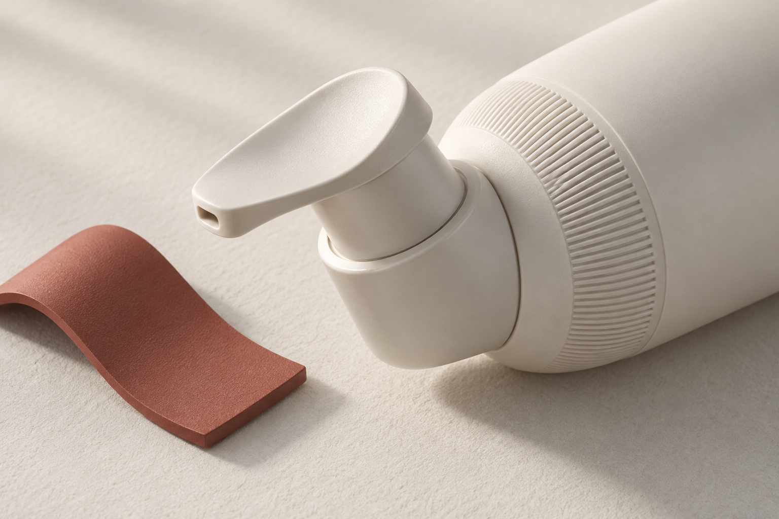
AI-generated conceptual illustration of grip and actuator details; not an Amcor product.
Design news and analysis · Updated September 23, 2026
Skincare packaging has two jobs: win attention and work well in someone's hand. Amcor's September 10 preview for London Packaging Week puts that relationship in focus, presenting its Magic One airless dispenser alongside Mocha bottles and jars. The event was scheduled for September 16–17 at ExCeL London. Read Amcor's announcement and the event details.
The timing matters. Magic One and the Mocha bottle appeared in Amcor's March 2026 exhibition announcement. The September announcement describes a skincare-focused presentation, not evidence that the underlying products were invented in September.
For teams developing consumer products, the useful question is what this emphasis should change in a design brief. Our view: treat the package as an interface that people operate repeatedly, and evaluate its appearance together with the actions it asks them to perform.
The design opportunity is in the repeated gesture
Amcor describes Magic One as a lockable dispenser capable of a 0.3 ml dose at different angles, with a stated 96% product restitution rate. Those are supplier claims, not results independently tested by Jackson Hedden. They nevertheless point to concrete questions worth asking about any dispensing concept: how much comes out, how predictable is the action, and how much remains inaccessible?
Start with a sequence rather than a silhouette. Someone picks up the container, identifies the opening, unlocks it, positions a finger, dispenses a dose, and sets it down. Each transition is a design decision. A beautiful cap can obscure the correct action. A smooth surface can leave too little purchase. An elegant pump may ask the user to stabilize the bottle with the other hand.
These are hypotheses to test, not reasons to reject a particular aesthetic. Write the intended behavior into the brief: the first use should be understandable without coaching; the closure should communicate its state; the intended dose should be achievable without a surprise second press. This connects product design to observable behavior.
Specify tactile qualities as well as visual ones
A rendering can show a matte finish. It cannot establish whether a person can hold that surface with damp fingers, find the actuator without looking, or comfortably apply the necessary force. That distinction makes color, material, and finish decisions part of usability work.
Explore texture where the hand needs it rather than spreading it across the entire object. Compare actuator shapes at the same scale and with the same mechanism. Change one variable at a time so the team can tell whether a wider contact patch, different edge radius, or revised orientation actually helps.
Include people with different hand sizes and dexterity in formative testing. Record where they hesitate and how they compensate. If someone braces a bottle against the counter, the workaround is valuable evidence. Do not convert a small qualitative exercise into a broad accessibility claim.
Ask what the packaging claim leaves unanswered
The September announcement describes support for recyclability where appropriate systems exist and the incorporation of recycled material. That conditional language should survive any retelling. A desirable material choice does not, by itself, establish the complete package's environmental performance.
For a new project, ask suppliers for the component material list, decoration options, compatibility information, and the evidence behind disposal instructions in the intended market. Ask how a change in pigment, label, closure, or finish affects the proposal. Keep these questions attached to the actual configuration being quoted.
The same discipline applies to dispensing performance. Request the test conditions behind a recovery figure: the formula used, orientation, temperature, and definition of an empty pack. Treat an appealing headline number as the start of a technical conversation. Your own formulation and use conditions still need validation.
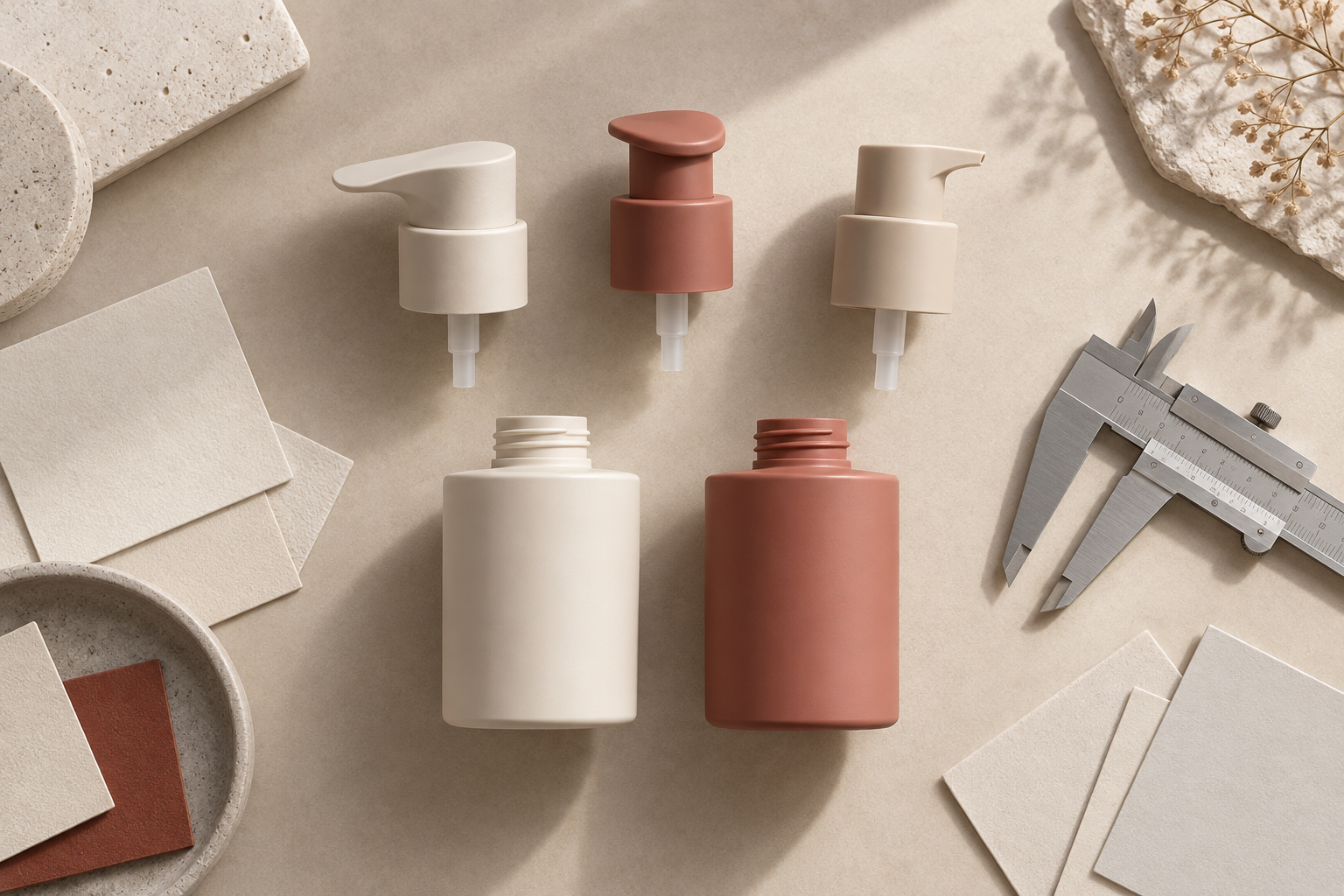
AI-generated conceptual packaging study; not Amcor products or a physical studio test.
Build a prototype plan before selecting the final shape
A useful early study separates appearance models from functional prototypes. Use the first to explore proportion, recognition, and shelf presence. Use the second to investigate force, dosing, leakage, and repeated operation. A single highly polished model rarely answers every question equally well.
Through prototyping, compare a small set of purposeful alternatives. Define the tasks before testing: open with damp hands, dispense the intended amount, relock the pump, carry it in a bag, and use it near empty. Choose pass criteria appropriate to the product, and document failures rather than explaining them away.
Finally, review the preferred direction with the manufacturing partner. Confirm which surfaces, tolerances, assembly steps, and finish choices drive cost or complexity. Resolve the interaction before committing to details that make it expensive to change.
What product teams should take from this news
The strongest brief will connect the promise seen in a product photograph to the experience delivered on an ordinary morning. Ask three questions at the next review: what action are we making easier, what evidence would show that improvement, and what tradeoff are we accepting to achieve it?
That approach travels beyond beauty packaging. It applies to a kitchen control, wearable clasp, charging case, or refill mechanism: the contact points deserve as much design attention as the overall form.
If your team is developing a physical product, talk with Jackson Hedden about connecting its form, user experience, and path to production.
Editorial note: This article combines sourced company announcements with Jackson Hedden design analysis. All accompanying images are AI-generated conceptual illustrations; they do not depict Amcor products or a physical test conducted by the studio.