James Cropper’s Colour Lab and the Packaging Color Brief
Design news and analysis · September 22, 2026
On September 20, James Cropper announced a Colour Lab presentation for Luxe Pack Monaco focused on consistent color across paper, molded fiber, and luxury packaging. The company says visitors will see live papermaking demonstrations during the event. Read the manufacturer’s announcement. The show runs September 28–30, according to the organizer’s event information; these are planned demonstrations, not results from a completed exhibition.
For product and brand teams, the useful design question is immediate: what does “the same color” mean when a package combines different surfaces? A color chosen on a screen is a direction. A coordinated physical package requires decisions about material, geometry, finish, viewing conditions, and acceptable variation. Our analysis: those decisions belong in the brief before a team approves the appearance of an isolated sample.
Specify the relationship between components
Consider a small consumer product delivered in a paperboard box with a molded fiber insert. The outer panel, folded edge, recessed tray, and instruction card may all belong to one color family, yet they occupy different positions and present different surfaces. Asking each supplier to “match the brand color” leaves an important question unanswered: which relationship matters when the customer opens the package?
Start with the assembled view. Decide whether the insert should visually merge with the box, provide a deliberate contrast, or remain visibly a different material. Each can be a sound design direction. Trouble begins when the team expects continuity but approves components separately without comparing the result.
A practical brief should identify the reference sample, the components being compared, and the moment in the experience where their relationship matters. This connects brand identity to a physical decision that designers and suppliers can discuss.
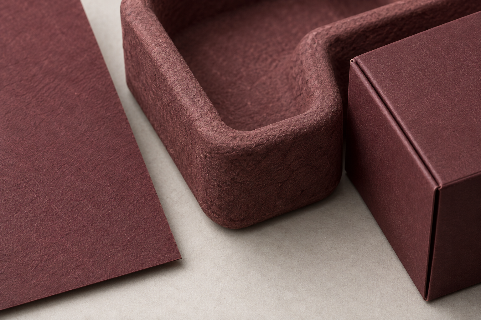
AI-generated conceptual illustration comparing surface and geometry; not a measured color test.
Review color on the shape that will be made
A flat swatch is useful for narrowing a palette. It cannot answer every question about a formed part. A tray has walls, corners, recesses, and transitions. Before approving the package, examine a representative geometry alongside the other components, rather than treating the flat sample as the final verdict.
Ask for a small set of purposeful comparisons. One can isolate the color direction; another can explore surface texture; a third can show the intended geometry. Record what each sample is capable of demonstrating. An appearance model can help assess a composition without proving that the same finish is ready for production.
This is also where alternatives deserve attention. A contrasting natural fiber insert may serve the design better than a difficult near-match. A visibly different interior can make the opening sequence intentional. The choice should follow the brand and product experience, with supplier feasibility checked, rather than a reflex that every component must look identical.
Agree on how approval will happen
James Cropper’s announcement makes the craft of color reproduction the subject of its planned presentation. It does not publish a universal acceptance tolerance, an independently verified production yield, or a guarantee for every packaging construction. Teams should avoid reading those conclusions into an exhibition announcement.
For an actual project, agree with the supplier on a review method before requesting final approval. Identify the viewing conditions, the physical references, who can approve a change, and how sample revisions will be tracked. Where instrumental measurement is appropriate, have the supplier and color specialist define the method and acceptance criteria for the materials involved. A number without an agreed method can create more ambiguity than it resolves.
Include visual review of the assembled pack. A component that passes a separate check may still create an unwanted contrast in context. Conversely, a deliberate difference can be acceptable when everyone understands its role. Document that intention so a later production team does not “correct” a purposeful design decision.
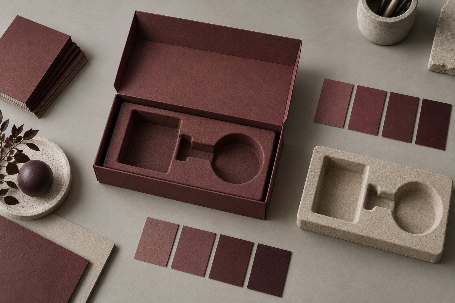
AI-generated conceptual illustration of a proposed sample review, not evidence of laboratory testing.
Keep appearance and environmental claims separate
A fiber texture can communicate a material choice, but appearance alone does not establish environmental performance. Nor does a coordinated color palette establish that the complete package can enter a particular recycling stream. Those are separate questions requiring evidence about the final construction and the markets where it will be sold.
At the design stage, ask what additions are needed to achieve the proposed finish and how they affect the rest of the specification. Compare alternatives using the same functional requirements: protection, assembly, handling, presentation, and the intended disposal route. Avoid approving a visual direction first and discovering its practical consequences only after the package architecture is fixed.
Bring a decision brief to the next sample review
For a founder or product leader, the next useful deliverable is a short approval brief supported by physical samples. Include the intended component relationships, an assembled reference, unresolved material questions, and the next decision each sample must support. Use prototyping to narrow those uncertainties in sequence.
The September announcement is a timely reminder that material expertise can inform brand expression. Its broader lesson is practical: color consistency should be defined as a shared decision process, with evidence appropriate to the stage of development. If your team is bringing a product and its packaging into one coherent experience, discuss the challenge with Jackson Hedden.
Editorial note: Event and company details are attributed to the linked sources. The recommendations are design analysis, not a report of hands-on testing. Images are AI-generated conceptual illustrations, not James Cropper products or laboratory results.