Citizen’s New Series 8 Makes Material the Main Event
Citizen announced the Series 8 NB6092-01E on September 24, 2026, a limited mechanical GMT watch pairing a forged-carbon dial with a Damascus-steel case center. The company says the model is scheduled for October and will be limited to 1,300 pieces worldwide. Independent coverage by Notebookcheck also reports the new GMT model and its material combination. Its launch presents a clear product-design question: when two materials carry their own visual pattern, how do you keep them from competing with the object’s basic job—telling time?
The answer is not simply to add more contrast. Material, finish, geometry, and information hierarchy have to work as one system. That is true for a watch, and for any consumer product where a distinctive surface is part of the brand proposition.
Two patterned materials, one visual hierarchy
Citizen describes the case center as layered, modern Damascus steel, while the dial uses randomly mixed and molded short carbon-fiber strands. Each produces a pattern that varies from piece to piece. The brand pairs those surfaces with a gold-color case treatment, hands and indices, and a black-and-brown 24-hour bezel.
This is a high-density composition: Damascus pattern at the case, mottled carbon on the dial, a two-tone bezel, and metallic details. The watch’s challenge is to let material character create distinction without making the time display harder to scan. Citizen lists luminous hands and indices and an anti-reflective sapphire crystal. Those specifications point to functional support for legibility, but only wearing and viewing the production watch can show how well the full combination performs across lighting and wrist angles.
For product teams, this is a useful reminder that material selection is also information design. Pattern, gloss, reflectivity, and color contrast affect which surfaces attract attention first. In an interface, that hierarchy can separate controls from decoration; in a physical object, it can help a user find a dial, grip, seam, button, or status light.
A material story has to survive finishing and use
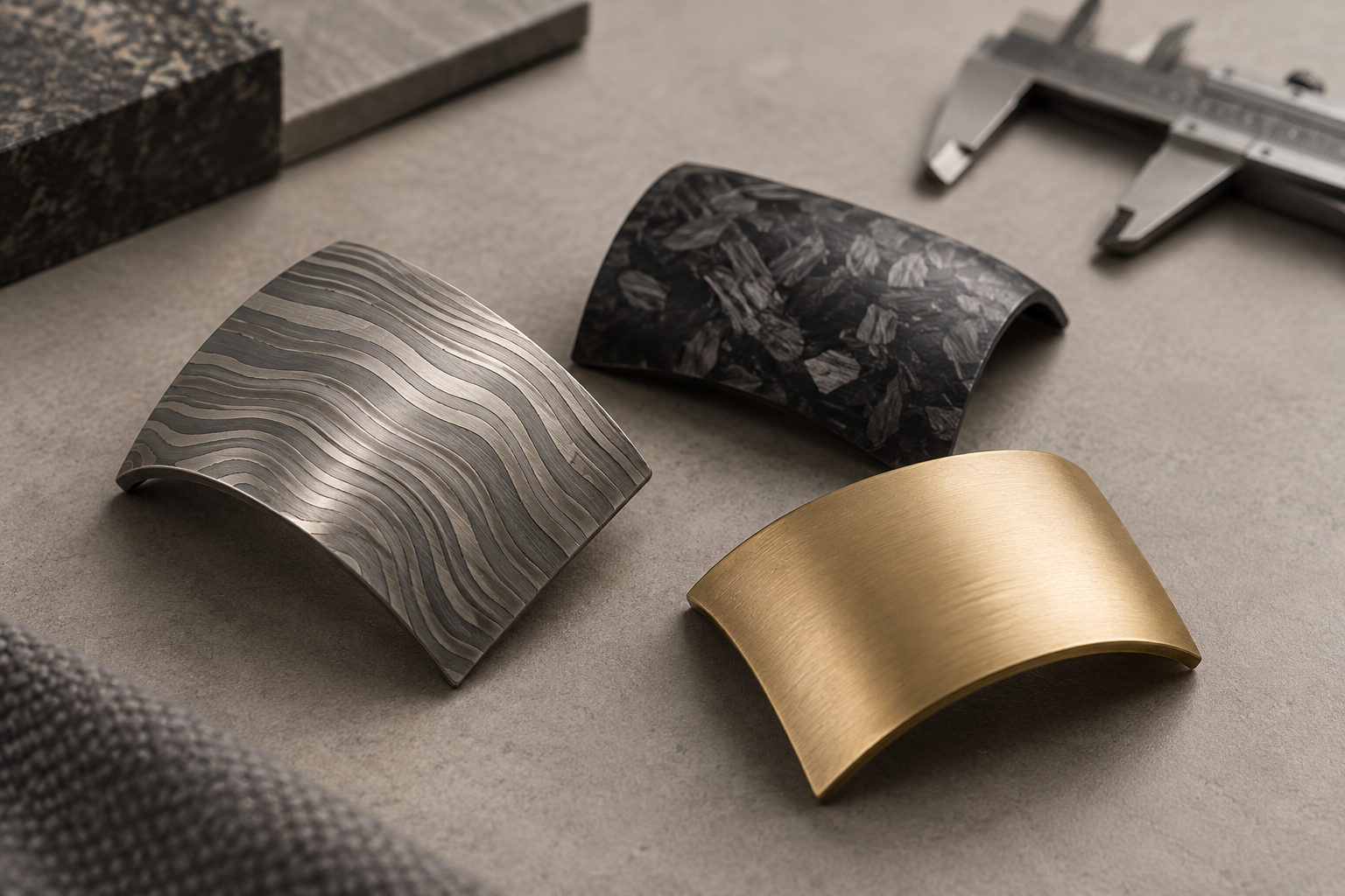
AI-generated conceptual illustration of material contrast; samples do not depict verified Citizen production materials.
“Damascus steel” carries historical associations, but Citizen clarifies that modern Damascus steel is made differently: multiple layers of stainless steel are forged together. The pattern becomes part of the material’s visible identity. The company says the forged-carbon dial also varies from watch to watch because of the fiber arrangement.
That variation can make an object feel individual, but it creates a consistency brief. Designers and manufacturers must decide how much pattern variation is acceptable, how the finish reveals or softens it, and how parts will look next to one another in production. A gold-color surface changes the material’s visual read again. Teams should specify both measurable requirements—color range, reflectivity, wear resistance, cleanability—and the visual character they want to preserve.
These are questions for inspection and wear testing, not assumptions that can be settled by a launch image. A production plan should include representative samples, lighting checks, abrasion and skin-contact considerations, and review of how the pattern reads after finishing. For small-batch or limited products, quality criteria still need to be repeatable even when every surface looks a little different.
Function should justify the form
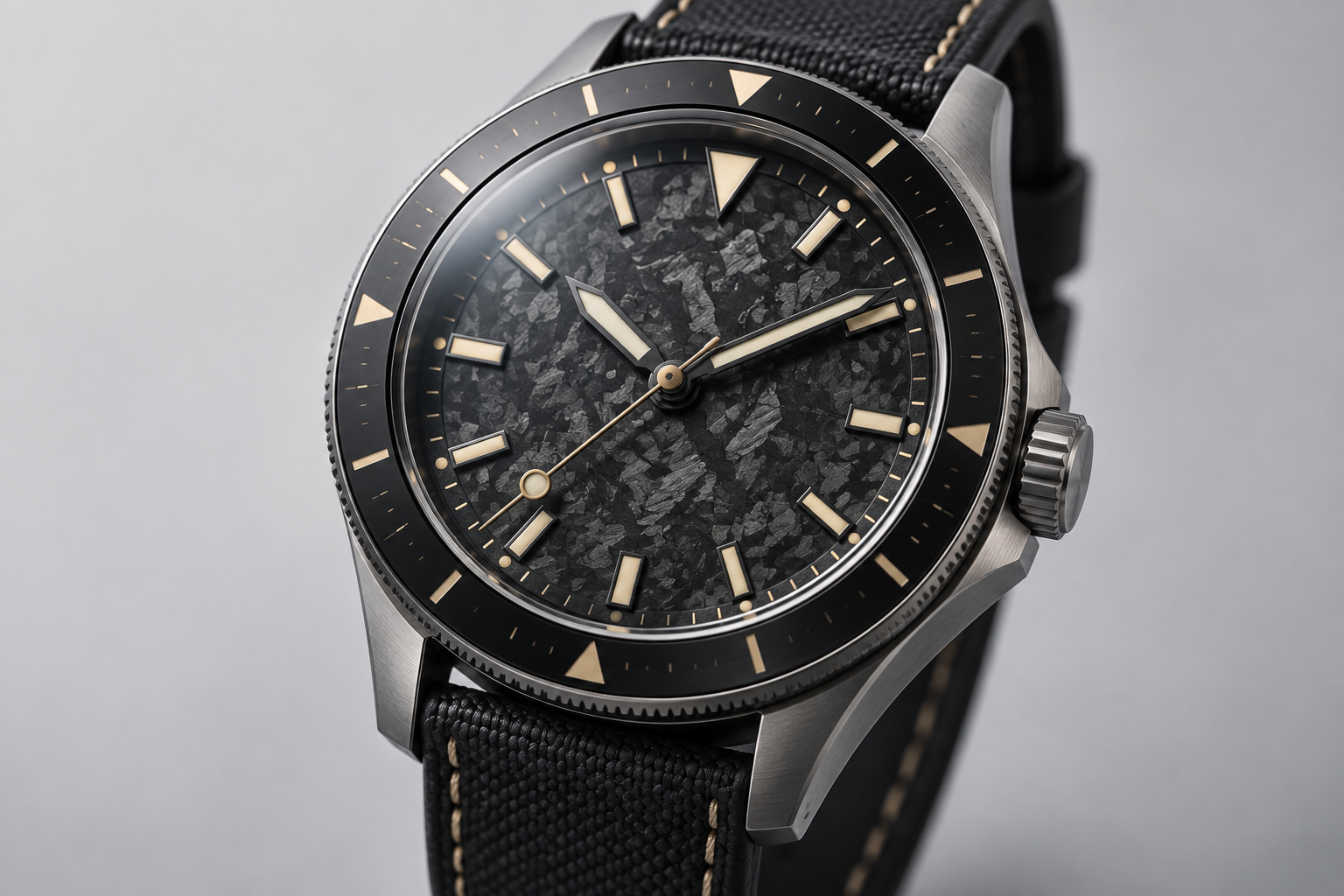
AI-generated conceptual illustration; not a product photograph or legibility test.
The NB6092-01E pairs its material treatment with a traveler GMT movement. Citizen says the local hour hand can move in one-hour increments without stopping the minute, seconds, or 24-hour hands; the rotating bezel enables readings across up to three time zones. The announced case dimensions are 41 mm across and 13.5 mm thick, and the planned model includes a leather strap, 10-bar water resistance, and a transparent case back.
Those details matter because a material-led object still has to fit its tasks. A patterned bezel or dial can strengthen the product’s identity, but the markers and control logic need to remain readable. Case diameter and thickness affect how a watch sits beneath a cuff and how it feels during a full day. The GMT function adds a second layer of information; the bezel and hands must make that information understandable without asking the wearer to decode a visual puzzle.
A strong design review therefore asks more than whether the surfaces look premium. Can the wearer read local and reference time quickly? Does the bezel provide enough contrast? Does the strap balance the metal case in weight and comfort? Do the material transitions feel intentional at the lugs, crown, and case edges? These questions connect industrial design, CMF, interaction, and manufacturing instead of treating them as separate handoffs.
What product teams can take from the launch
Citizen’s announcement is a scheduled limited release, not an independent performance evaluation. Price, launch timing, specifications, and final design may still change. The product’s eventual reception cannot be inferred from its press images. But the design brief is already instructive: patterned materials can create a compelling identity when their placement is deliberate and the functional hierarchy remains clear.
For teams considering expressive materials, prototype the whole assembly—not just a material swatch. Review visual noise, tactile edges, glare, weight, cleaning, wear, and the way nearby parts meet. Test whether people can find the functional information at a glance, then adjust contrast and finish before tooling or production commitments narrow the options.
Jackson Hedden helps teams connect product form, material choices, and practical development decisions. If you are exploring a material-led product, start with product design, use prototypes to resolve the experience, and talk with the studio about the tradeoffs your product needs to solve.