The October Packaging Showcase Puts Opening in the Brief
On October 1, 2026, the Flexible Packaging Association published its October innovation showcase. Among the highlighted examples are BrightFarms salad packaging with peel-and-reseal lidding, a Heart & Steel granola pouch with a window and zipper, and a plant-food pouch carrying branding on both front and bottom panels. The publication is a new roundup; it does not establish that these packages were first launched this week.
For teams designing consumer products, the useful connection is physical interaction. A package communicates through the place someone pulls, the view it offers and the way it stands after use. Our analysis is that those details belong in the product brief as early as the graphics. They determine whether the promise made on the shelf remains understandable in the kitchen or cupboard.
The images are conceptual packaging studies. They do not depict the named commercial products or establish performance results. Jackson Hedden has not tested these packages.
Make the first opening easy to find
A pull tab is both a mechanical feature and an instruction. Its location tells someone where to start; its exposed area determines how they can grip it. A beautifully quiet graphic layout can work against the object if the opening point disappears into the edge.
TOPPAN's SmartSeal lidding description says the supplier can vary pull-tab location and opening size, and offers multiple reseals. Those are supplier capabilities, not evidence that every resulting package will be comfortable for every user. They are also a reminder that opening geometry is a choice, rather than an unavoidable detail.
For a new product design brief, specify the intended action: lift a corner, peel across a rim, pour a portion, or remove the entire lid. Then explore how the action works with the actual grip, surface finish and orientation. A larger tab can offer more purchase while occupying more graphic or seal space. A shorter peel path can be convenient while limiting access. The preferred option depends on the job.
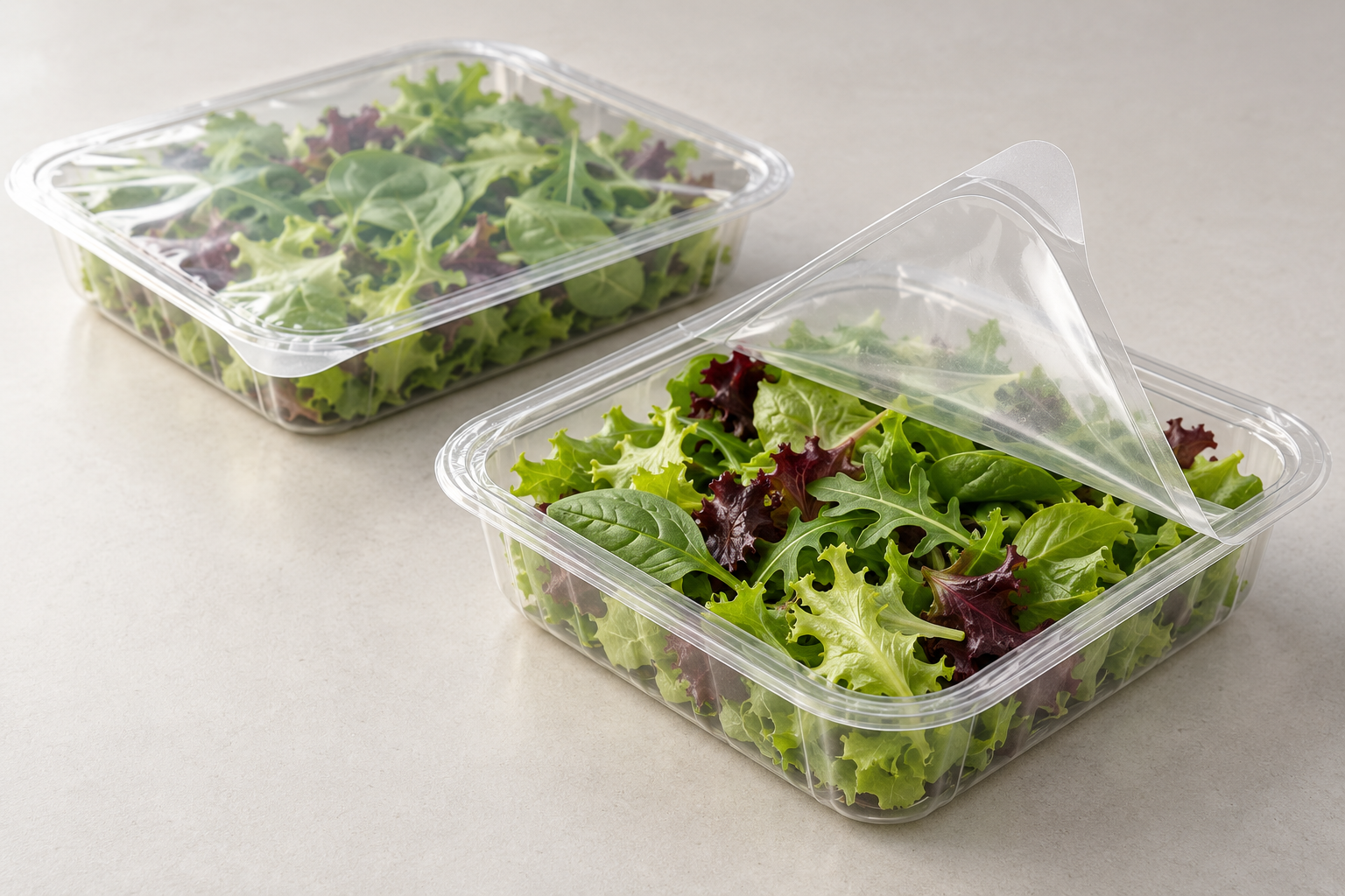
Conceptual illustration of opening geometry, not a commercial package or verified seal performance.
Design the second use, not only the first seal
The association highlights reclosure in both a salad tray and a granola pouch. That comparison is useful because the same word can describe different actions. Pressing film back onto a tray and joining a zipper are different physical experiences. A team should define what a user must do to complete the action and how completion becomes apparent.
Our recommendation is to prototype an ordinary use sequence: open, remove a portion, close, store, retrieve and reopen. Include an imperfect attempt. Someone may press only part of a rim, leave a zipper partly joined or fold the package in an unexpected way. The question is whether the design makes a mistake visible and recoverable.
A satisfying closing sensation should not be used as a substitute for a verified barrier specification. Conversely, a technically adequate closure may still require too much explanation. Ask the supplier what has been validated, under which conditions, and how the proposed structure differs from the sample being evaluated. Usability and product protection need separate acceptance criteria.
Check visibility across the package's life
A window can help a shopper inspect the contents. It also takes space from graphics and changes what the package shows as the fill level drops. A design approved while full may present a less useful view after several portions have been removed.
Build appearance samples at full, partial and near-empty states. Compare upright, laid-flat and folded storage. This is especially useful when a design relies on a large uninterrupted brand panel or a window placed near the top. The question is not whether transparency is inherently better; it is whether the visible information supports the decision someone is making.
The showcase's front-and-bottom branding example invites a similar check. Which face actually appears in the intended display and storage orientations? Extra printing is only useful if it clarifies recognition without crowding instructions or creating conflicting reading directions. Review physical samples from the viewing distances that matter rather than approving every panel as a separate flat artwork.
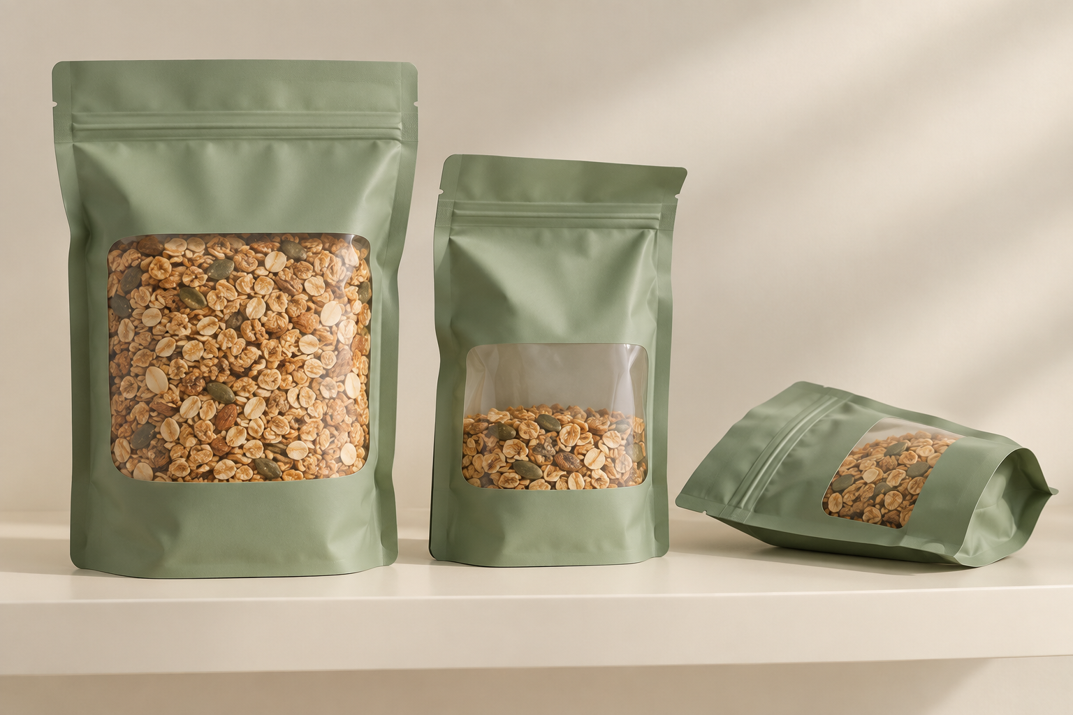
Conceptual illustration of window and orientation choices, not the featured commercial products.
Turn an appealing sample into a testable brief
For founders and product leaders, the next step is a small prototype plan that separates appearance, interaction and protection. An appearance model can compare a window position. A functional sample can compare opening and closing actions. A supplier production sample can support the relevant technical evaluation. Label what each sample can answer so a convincing visual does not become accidental evidence.
There are alternatives worth keeping open. A single-use package may suit a genuinely single portion. A separate rigid lid may give clearer closure feedback but add a component. An opaque structure may provide a stronger graphic surface when visibility offers little practical value. Choose against the actual use case and the verified production constraints.
The October showcase makes these decisions easier to see, but it does not settle them for a different product. Put the opening point, repeat-use sequence and changing package orientation into the brief before the visual identity is finalized. If your team is developing a physical product and its packaging together, discuss the design challenge with Jackson Hedden.