Samsung SmartTag3 Makes the Whole Finding System the Brief
Samsung announced Galaxy SmartTag3 on September 30, 2026, pairing a smaller, lighter tracker with cross-platform finding and sharing, expanded alerts and longer-range guidance on supported phones. Its U.S. release is planned for early November. The official announcement makes this a useful current design case: the device, attachment and phone experience must work as one system.
For founders developing connected accessories, the most interesting question is what happens after the customer chooses a color. Where does the object go? Who can use it? What should a person believe when the screen shows a location? Those decisions determine whether a compact piece of hardware becomes a dependable everyday tool. The following is design analysis of the announcement, rather than a product review or independent performance test.
Design the attachment before celebrating the smaller object
Samsung lists a Silicone Case with a keyring and a Loop Case as separately sold accessories. Tom’s Guide’s September 30 hands-on report also describes the new puck-like form and those attachment options. That independent event coverage corroborates the physical design direction; it does not establish long-term reliability.
A smaller enclosure can disappear into daily life, but its usefulness depends on the surrounding assembly. A sleeve, ring or strap adds thickness, weight, purchase decisions and installation steps. Teams should compare the complete carried object, rather than only the bare device. A tidy rendering can conceal a sleeve that catches on a pocket edge or a ring that interferes with a zipper.
Different mounting strategies solve different problems. An integrated eyelet makes attachment immediately understandable, but commits part of the enclosure to a particular use. An accessory sleeve can adapt a common electronic core to more contexts, at the cost of extra parts and another interface that can fail. A strap mount can keep an object close to a bag, while making transfer less convenient. None is universally best.
Make these tradeoffs part of the product design brief. Specify the carried assembly’s size, installation effort, snagging behavior and retention requirements. Evaluate removal as deliberately as attachment. A user should be able to move the product when intended without accidentally losing it during ordinary handling.
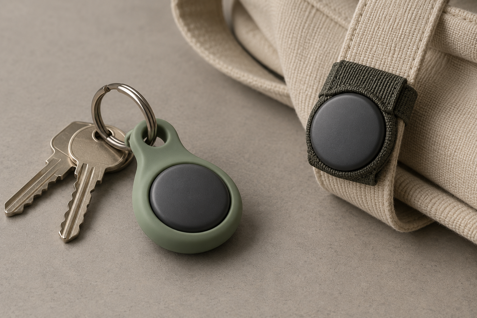
Conceptual illustration of attachment choices, not Galaxy SmartTag3 or a tested retention system.
Compatibility needs a visible boundary
Samsung says Galaxy and iOS users can access core finding and sharing through SmartThings Find. Its footnotes exclude Compass View, Ring Phone and Left Behind Alert on iOS. Cross-platform access therefore does not mean feature parity.
That distinction belongs in the buying and setup experience. A mixed-device household might reasonably expect everyone who shares an object to receive equivalent guidance. If the supported experience differs, a generic compatibility badge leaves the customer to discover the boundary at the worst moment: when something is missing.
For a new connected product, build a task-based compatibility table during development. Separate ownership, invitations, nearby finding, alerts and recovery. Then test whether a prospective customer can identify which tasks work on their own phone before purchase. The same table should inform onboarding, support scripts and packaging. It should remain readable as features change.
In shared use, permission is also an interaction design problem. People need to understand who has access, how long that access lasts and how to end it. A borrowed suitcase is a useful scenario for testing this sequence: invitation, acceptance, finding, return and removal of access. The design should make the end of sharing as clear as the beginning.
Finding information should communicate uncertainty
Samsung’s network-based updates depend on nearby participating devices and conditions. It identifies Place Notification as a trial feature and warns that notifications can be delayed or absent. These qualifications matter when interpreting the headline features.
The design implication is straightforward: avoid making old information look live. A location marker without an obvious age can invite the wrong conclusion. A product team should prototype how the interface presents a recent observation, a stale observation, a direct connection and a period with no useful update. Each state should suggest an appropriate next action.
Alerts require similar judgment. More notifications can create more reassurance in a demonstration and more friction in daily use. Teams should examine what happens after an alert, including repeated alerts, ambiguous movement and changing household routines. Where the information is uncertain, the wording should express that uncertainty rather than imply an event has been conclusively verified.
A network-dependent item finder should not be presented as a guaranteed safety monitor. The development brief needs a clear account of the intended job, the situations outside it and how those boundaries are explained. Better industrial design cannot compensate for an unclear promise.
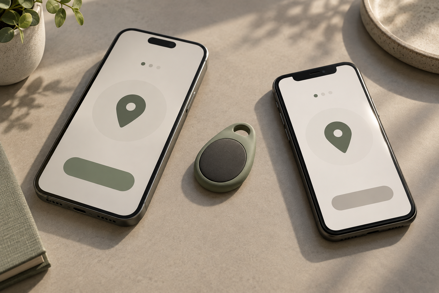
Illustrative design study of shared-device setup, not Samsung hardware or a working app interface.
Prototype the ownership cycle, not only first use
Samsung’s battery estimates come from internal simulated testing; it notes that actual life varies and that power-saving mode restricts features. A long-life claim is therefore one part of an ownership experience, rather than proof that maintenance disappears.
For another product in this category, map the full sequence: first attachment, setup, sharing, carrying, finding, maintenance and eventual transfer to a new owner. Use physical and interaction prototypes to uncover where those steps conflict. A retention mockup can reveal handling problems without finished electronics. A simple screen prototype can expose a confusing invitation or an overconfident status message before software architecture becomes expensive to change.
The practical lesson from SmartTag3 is to measure the complete experience. Compactness, connectivity and convenience only become valuable when the object stays attached, the supported tasks are clear and the information earns the right level of trust. If your team is developing a connected consumer accessory, discuss the product challenge with Jackson Hedden before the enclosure and interface become separate commitments.